It’s no secret hospitals and medical facilities can be incredibly stressful, for both patients and their families. And while there’s no way to completely eliminate that stress, an effectively designed hospital can help to reduce and mitigate it. But what exactly does patient-centric design look like? And how can it be realized within the parameters of sustainable building? Let’s take a look at a few hospital design elements that help ease patients’ minds and make them feel at home.
In recent years hospital architects and designers have started to move away from the sterile, stark cavernous rooms and corridors of the past, preferring instead to prioritize patients’ well-being and design facilities that incorporate nature, comfortable furniture, natural lighting, and other welcoming elements.
These are some of the design elements architecture teams love.
1-Comfortable Waitig Areas
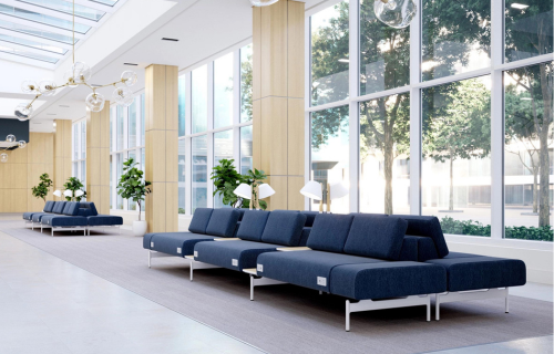
Upon stepping inside a hospital, one of the first things a patient or visitor sees is the reception desk and waiting room—and it is these places that are often the most stressful parts of a visit.
Waiting can be incredibly anxiety-inducing. To help patients mitigate this stress, waiting rooms should be comfortable and provide positive distractions. This can be achieved through the inclusion of large windows to provide daylight and views outside, art, murals, or interactive spaces for visitors to focus their attention on, and comfortable furniture.

2-Internal Wayfinding Tools
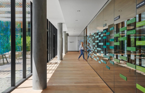
Hospitals, especially large ones, often have sprawling, complex layouts that can be difficult to navigate, adding to the stress patients and visitors may feel. For this reason, it is important to include appropriate, intuitive wayfinding tools that allow even first-time visitors to find their way with ease.
Historically, signage and maps have been the preferred wayfinding methods in hospitals—and while they certainly have their place, excessive use of these tools can become distracting or even overwhelming, especially for visitors whose first language isn’t English or who don’t speak English at all.
Using images and symbols for wayfinding purposes can prove invaluable in this regard, as many symbols are universal, and our brains process images much faster than words. Incorporating graphics and color coding can also make wayfinding simpler and less daunting for younger patients or visitors who aren’t in a clear headspace.
If all else fails, using prominent signage to direct visitors and patients to common areas is an easy way for them to find someone who can point them in the right direction. After all, most modern hospitals have visitor support staff, information desks, or even interactive kiosks that can help people find the room they’re looking for.
3-Ample Daylighting
While it’s often not possible to illuminate every room in a medical facility with natural light, design experts say special care should be taken to include daylighting solutions wherever possible.
This is especially true for reception areas, patient rooms, waiting rooms, and any other communal rooms in which patients and their families/visitors may spend considerable time. Natural daylight has obvious benefits from a sustainability standpoint, but it can also help boost psychological and physical health.
Indeed, studies have shown that patients who are treated in facilities that prioritize daylighting over electric lighting heal faster and experience less pain, resulting in shorter hospital stays.

4-Welcoming Clinic Environments
It’s one thing to design waiting rooms, reception areas, and patient rooms to be warm and inviting, but these characteristics should also extend to the hospital’s clinical areas whenever possible.
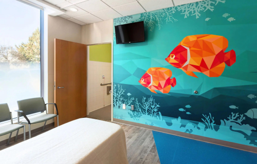
Often imaging suites, blood-draw stations, and other clinical rooms designed for conscious procedures lack the welcoming design elements found in other parts of a hospital, adding to patient stress levels. For this reason, clinical areas should incorporate daylighting and contain positive distractions—think art, murals, photos, and the like—to facilitate a calm environment.
5-Theming
Another way to make patients feel at home is by establishing a coherent theme through art, murals, and wallcoverings. Nature is an excellent and widely applicable theme that can be tailored to specific environments, providing a sense of familiarity and locality to combat feelings of anxiety and stress.
Wall coverings and panels, for instance, can be embedded with digital imagery and photos of nature scenes and local landscapes, while customizable wall coverings can incorporate organic patterns, textures, greenery, and other biophilic elements to invoke the natural world.

6-Intentionality of Color
In a similar vein, picking and choosing interior color schemes with intentionality is crucial to making patients—especially those who are children—feel comfortable and at ease with their surroundings.
Neutral and earth-tone color palettes are ideal for usage in waiting rooms and common areas, as cool, muted colors have a calming effect on the human mind, but splashes of color and accent walls can also help to draw focus and brighten up a room. In general, suggested to stay away from bright, bold colors, even though these may be used sparingly and appropriately in areas for children.
When used correctly, adhering to a color scheme can even aid in navigation and wayfinding.
7-Accesible Green Spaces
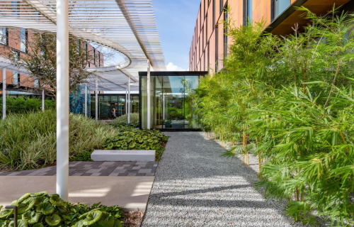
Of course, biophilic design strategies in color and décor have their limits, and nothing beats actually experiencing nature outdoors, which is why having easily accessible green spaces is integral to fostering patient well-being.
Gardens, terraces, and accessible green roofs invite patients, their families, other visitors, and staff to access fresh air and interact with the natural world in a more intimate manner. Studies show that access to these sorts of green spaces can actually improve psychological health and reduce stress, which in turn helps patients recover faster and makes hospital employees more productive.

8-Use of Sustainability Materials
Nothing says “we care about your health and well-being” like constructing a hospital from sustainable materials that won’t leach harmful chemicals or toxins into the air over time.
Taking care to design medical facilities using materials that are red list-free or products that do not include any chemicals deemed, ensures patients will not be exposed to volatile organic compounds or other potentially damaging materials during their medical stay.
What’s more, sustainable materials like wood and stone are an easy way to incorporate biophilic design strategies and foster connections to the natural world.
8-Ensure Dignity Upon Discharge
Lastly, it’s important for patients to feel confident and dignified upon being discharged from the hospital, especially if they are using mobility aids for the first time or are still recovering from surgery or a procedure. Often this looks like having a dedicated exit specifically for patients who wish to leave discreetly or with added privacy, as opposed to the main entrance.
A separate exit can also have the added benefit of easing the minds of patients who are entering the hospital for the first time.
As we navigate these pivotal design principles, it becomes evident that the arena of hospital design is in constant evolution. These elements, while universal, take on a unique significance within different cultural and regional contexts. Saudi Arabia, with its strategic vision and substantial investments in healthcare, stands at the cusp of a transformative era in hospital design and construction. For those looking to delve deeper and align with the future of healthcare infrastructure, our "Saudi Hospital Design & Build Expo" serves as the definitive gateway to tap into the Kingdom's boundless opportunities.
Source: gb&d magazine
Subscribe to Saudi Hospital Design & Build Expo newsletters to get informed on all events news and updates.