The Victorian government has made a case for the efficacy of good hospital design and its influence on patients and staff. Yet most healthcare providers are stuck in the past; continuing to work in cold, unwelcoming, and uninspiring spaces.
Things are changing. Patients are now shopping for the best outpatient services. Most are willing to travel to the next suburb over for a better experience. Below uncover the latest medical center design trends that healthcare providers should look out for in 2024.
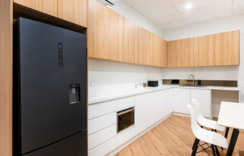
1-Less Clinical, More Homely
Bright lights, white walls and tiles communicate clean.
But they also communicate clinically. And for some patients with hospital phobia, these design choices could also induce stress.
To encourage a happy patient experience in 2024, medical centres will start to prioritise comfort and relaxation from reception to consultation. The trend is already happening internationally.
Take this migraine treatment centre in Poland, for example. The centre deviates from traditional medical environments and encapsulates and looks more like a day spa as opposed to a clinic. Given that migraine sufferers are sensitive to all types of external stimuli, architects built a space that doesn’t overload the senses. What you get are very natural finishes and consultation rooms that capture and diffuse natural light.
The home-centred design includes more natural elements and lighting, comfortable seating, and tones outside of the standard clinical white. It’s a trend that aims to reduce stress levels and transform routine medical centre visits into something patients look forward to.
2-Raw Materials With Antimicrobial Qualities
It is estimated that around 165,000 healthcare-associated infections (HAIs) occur each year. There’s no way around it. No matter how pristine and clean the hospital, infection will spread at some point during the year.
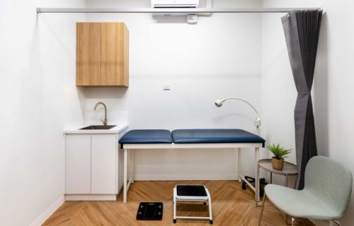
To combat this, medical centers are incorporating infection-controlling raw materials into their fitouts. This could be something as simple as:
3-Wayfinding
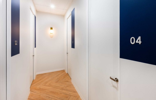
Wayfinding turns a hospital into a map that is easy for patients to navigate. It involves the use of differing patterns and colours on walls, floors, or both to differentiate between various locations within a centre.
Wayfinding also works to accommodate people with various disabilities (e.g. tactile flooring for blind patients).
While serving as a tool for navigation, wayfinding elements are an opportunity to move away from clinical monotone colours and experiment with something more aesthetically pleasing to the patients. Wayfinding also reduces the spread of germs, as patients navigate without the need to talk to a receptionist.
4-Natural Light & Greenery
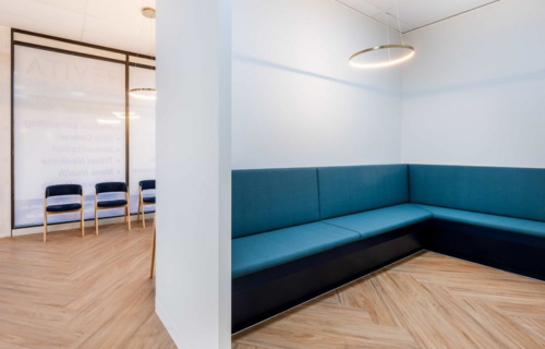
Similar to trends in dental clinic design, some hospitals are opting for very natural fit-outs. This includes plants and other greenery along with elements of natural light where possible.
When these elements can’t be incorporated naturally, some clinics opt to use natural lighting fixtures with green, earthy tones in the furniture, walls, and other areas.
5-Kid-Friendly Medical Centre Design
Whether hospitals see children, adults, or a mix, the design of your space should accompany both.
Games and play spaces can help children pass the time in the waiting room. If limited space, a feature wall could also function as a sensory board for toddlers to interact with. Wall art, paintings, and murals add another homely touch for adults.
If hospitals see children primarily opt for brighter colors and more art in consultation rooms. Physicians can use these design elements to direct children’s eyes away from a potentially uncomfortable procedure.
6-Separate Post-Procedure Payment Area
When the visit is over and the patient has recovered, it’s time for payment. Medical costs can vary from patient to patient, with each patient in various financial situations. It can be very uncomfortable to have private discussions about healthcare and fees in a crowded waiting area.
Creating a holistic environment doesn’t stop after the consultation. A recent trend in dental fit-outs is to have a separate area for payment. Including an area like this in your fit-out can make conversations regarding insurance and payment methods easier for everyone to have.
It’s a little personal touch that shows hospitals care about the individual. And it’s the last chance for the team to imprint a positive memory on the entire experience.
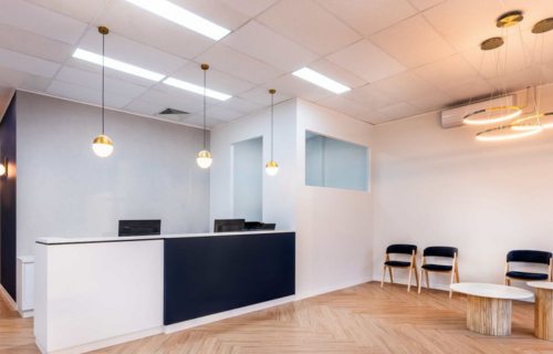
Most people won’t remember a thing said to them throughout their visit to the hospital. But they will remember how they felt on the day. How the hospital is designed could make a difference in keeping a lifelong client or scaring them away forever.
In the past, the family doctor served the entire family. Now more than ever, people are shopping around for the best patient experience, even if that means leaving their local suburb. Good design and on-trend design can help hospitals create the most optimal experience for the patients.
As we navigate these pivotal design principles, it becomes evident that the arena of hospital design is in constant evolution. These elements, while universal, take on a unique significance within different cultural and regional contexts. Saudi Arabia, with its strategic vision and substantial investments in healthcare, stands at the cusp of a transformative era in hospital design and construction. For those looking to delve deeper and align with the future of healthcare infrastructure, our "Saudi Hospital Design & Build Expo" serves as the definitive gateway to tap into the Kingdom's boundless opportunities.
Source: Canopy Fitouts
Subscribe to Saudi Hospital Design & Build Expo newsletters to get informed on all events news and updates.